Its been 18 months since CyclingMonks first hit the interweb.
In this year and a half, I am happy that this blog has grown, improved and learnt a lot along the way.
The essence of CyclingMonks from the beginning has been to share stories about cycling in India, from every corner of the country. Tales which range from travelling this vast land, to the racing scene in various pockets of this country, to the endurance bikers which India is teeming with. The country is home to a billion people and surely a bazillion stories!
I have captured a tiny fraction of these interesting cyclists which are plentiful in our country. Going into the future, I hope to bring to you, dear reader, many more such awe-inspiring, jaw dropping tales from India.
So yes, New Logo…
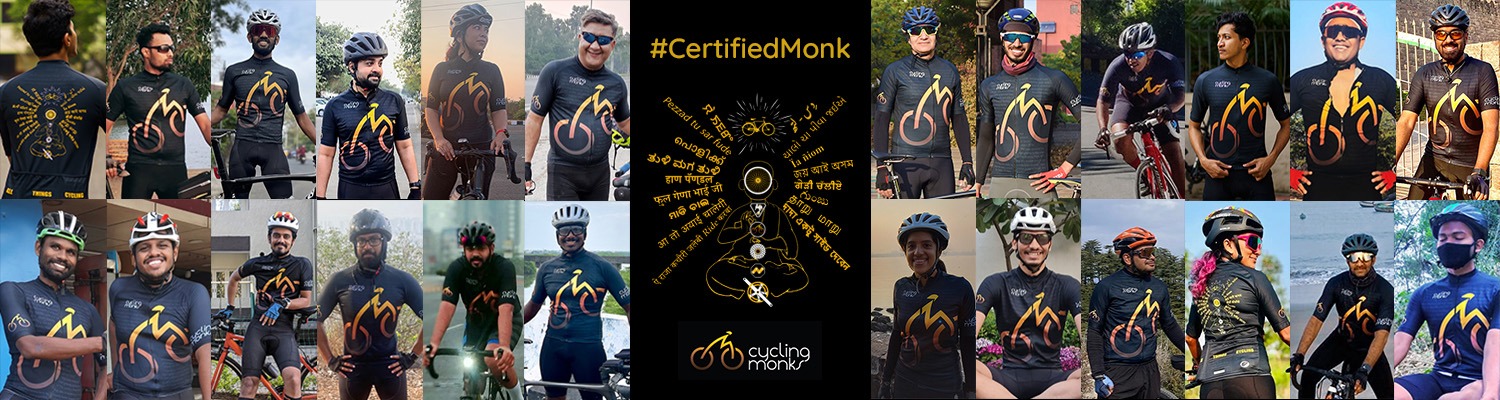
To mark this renewed focus, I am happy to share this new logo of CyclingMonks on this extremely auspicious day.
What better than April Fool’s Day to toast all the batshit crazy cyclists in this country who do insane stuff. Where onlookers have only one thing to say, “These people are nuts!”
I thank my good friend Pranav for designing this logo for CyclingMonks and all the countless friends who gave their valuable inputs along the way. Pranav belongs to this super talented bunch of graphic designers from i-imazine, so hit them up for all things design!
The Design…
Cycling is an immersive experience. And with each pedal stroke, you are taken back to your childhood, experiencing a sense of calm, becoming one with nature and enthralling your senses with an earthy connect.
The logo typifies that. The rider once on the back of the saddle, slips into the state of zen, which is brought about by meditating on your pedals. As you keep spinning those pedals, gradually you are brought in contact with mother earth.
Of course, you sometimes crash, and come a little too abruptly in contact with mother earth. But that is a story for another day!
As with any art, your body becomes one with the tools at your disposal. The rider is one with the bike. Inseparable in spirit. Those who ride clipless will remember their first fall and how they were inseparable in body as well! Much to their annoyance…
The flowy nature of the text is an indicator to the nature of this blog. Which is to have cyclist lore flowing through every page.
The future beckons
In the midst of the COVID-19 lockdown, I do not know what the future has in store for any of us.
But in this ‘fool’s new year’ I will try my best to increase the blogging in terms of both, quantity and quality!
Lemme know what you lovely folks think of the new logo…
This logo is more aerodynamic where man and machine meld into each other. Almost missed the M, which I presume is the Monk’s part. Pedal on and peddle your wares👍👍👍🚵🚵🚵
This is a awesome design.